Unifying Two Enterprise Products Through a Scalable Design System
Unifying Two Enterprise Products Through a Scalable Design System
Unifying Two Enterprise Products Through a Scalable Design System

TL:DR
TL:DR
Built a shared design system to unify two enterprise web products under one visual language
Worked within OutSystems constraints while improving typography, color, and iconography
Introduced Microsoft Fluent icons to replace inconsistent defaults
Defined clear foundations → components to reduce design and dev rework
Shipped a lightweight, usable system, not over-documentation
Result: Faster delivery, clearer UI decisions, and a system built to support products reaching hundreds of thousands of users

MY ROLE
MY ROLE
Product / Design System Designer
Product / Design System Designer
Product / Design System Designer
COMPANY
COMPANY
NDA Bound
NDA Bound
NDA Bound
COMPANY SCALE
COMPANY SCALE
~$43B enterprise
~$43B enterprise
~$43B enterprise
TIMELINE
TIMELINE
6 Months
6 Months
6 Months
Introduction
Introduction
This work began when two enterprise products were being developed in parallel. Each product solved different operational problems, but both were meant to live under the same ecosystem. In practice, they looked and behaved very differently.
As more internal tools were introduced, these differences became more visible. Patterns were repeated inconsistently, UI decisions were made locally, and teams spent increasing time aligning visuals instead of focusing on product problems.
The goal wasn’t just consistency. It was to create a shared foundation that could support multiple products and continue to hold up as the organization grew.

Why a Design System Was Needed
Why a Design System Was Needed
As the products scaled, the lack of a shared design language started to affect both quality and speed. Colors, typography, spacing, and layout decisions varied across tools, making the ecosystem harder to maintain.
Designers repeatedly solved the same problems. Developers rebuilt similar components in slightly different ways with their own freedom. With more products planned, this approach clearly wasn’t sustainable.
A design system was needed not just as a visual refresh, but as long-term infrastructure.
Identifying the Problems
Identifying the Problems
A closer look at the existing products revealed recurring issues that slowed teams down.
There was no reliable style reference, so decisions were often based on screenshots or past implementations. To move quickly, teams leaned heavily on default UI components from the OutSystems IDE, which resulted in interfaces that felt dated and inconsistent.
Over time, layouts, spacing, and interaction patterns drifted further apart, making the products feel disconnected and cluttered.

Goals to Be Achieved
Goals to Be Achieved
The aim was to build something practical and usable.
The system needed to unify products visually while remaining flexible for different workflows. It had to reduce repeated effort, speed up delivery, and give teams confidence when making UI decisions. Just as importantly, it needed to scale alongside future products.
Success meant teams could move faster without losing consistency.
Design Audit
Design Audit
I started with a focused audit to understand what already existed across both products.
By mapping components, layouts, and patterns side by side, it became easier to identify duplication, gaps, and areas where inconsistency was affecting usability.
I started with a focused audit to understand what already existed across both products.
By mapping components, layouts, and patterns side by side, it became easier to identify duplication, gaps, and areas where inconsistency was affecting usability.
I started with a focused audit to understand what already existed across both products.
By mapping components, layouts, and patterns side by side, it became easier to identify duplication, gaps, and areas where inconsistency was affecting usability.
Starting With Intent
Starting With Intent
Before designing components, aligning on intent mattered more than visuals.
Stakeholders wanted a system that felt coherent across products, recognizable as part of the same ecosystem, and adaptable to future needs. At the same time, it had to stay lightweight enough for teams to adopt without friction.
This intent guided decisions throughout the project and helped avoid unnecessary complexity.
Deconstructing the System
Deconstructing the System
To make the system scalable and easier to adopt, I broke it down into a few clear foundational layers.
To make the system scalable and easier to adopt, I broke it down into a few clear foundational layers.
To make the system scalable and easier to adopt, I broke it down into a few clear foundational layers.
TYPOGRAPHY
TYPOGRAPHY
Typography was one of the biggest challenges. The existing products relied on the default font provided by the OutSystems IDE, which limited flexibility and made the interfaces feel generic.
Introducing a new typeface required iteration, performance checks, and stakeholder alignment. Over time, by demonstrating improvements in hierarchy and readability, I was able to move forward with a font that better supported the products.
COLOR PALETTE
COLOR PALETTE
The color system needed to respect existing constraints. I took inspiration from the OutSystems IDE’s default colors to maintain familiarity, then adjusted values and hierarchy while introducing the client’s core visual guidelines.
This balance helped the system feel grounded while still moving the products forward visually.

ICONOGRAPHY
ICONOGRAPHY
Icon usage relied heavily on default OutSystems icons, which felt dated and visually inconsistent. I introduced Microsoft Fluent icons as the primary icon system, providing enough coverage for most use cases while bringing consistency in stroke, weight, and visual tone.
Icon usage relied heavily on default OutSystems icons, which felt dated and visually inconsistent. I introduced Microsoft Fluent icons as the primary icon system, providing enough coverage for most use cases while bringing consistency in stroke, weight, and visual tone.
Icon usage relied heavily on default OutSystems icons, which felt dated and visually inconsistent. I introduced Microsoft Fluent icons as the primary icon system, providing enough coverage for most use cases while bringing consistency in stroke, weight, and visual tone.
From Foundations to Components
From Foundations to Components
With the foundations in place, they were combined into reusable components shaped by real product needs.
Core elements such as buttons, badges, switches, and form controls were designed to handle common scenarios without unnecessary variants. More complex components like tables, alerts, and status indicators were built to be extended rather than duplicated.
This made it easier for teams to design and build while staying aligned.

Lightweight Documentation
Lightweight Documentation
Instead of heavy documentation, I focused on a concise reference that developers could quickly understand and apply through OutSystems IDE.
The goal was to provide clarity without slowing teams down, especially the Developers.
Instead of heavy documentation, I focused on a concise reference that developers could quickly understand and apply through OutSystems IDE.
The goal was to provide clarity without slowing teams down, especially the Developers.
Instead of heavy documentation, I focused on a concise reference that developers could quickly understand and apply through OutSystems IDE.
The goal was to provide clarity without slowing teams down, especially the Developers.
Implementation Across Products
Implementation Across Products
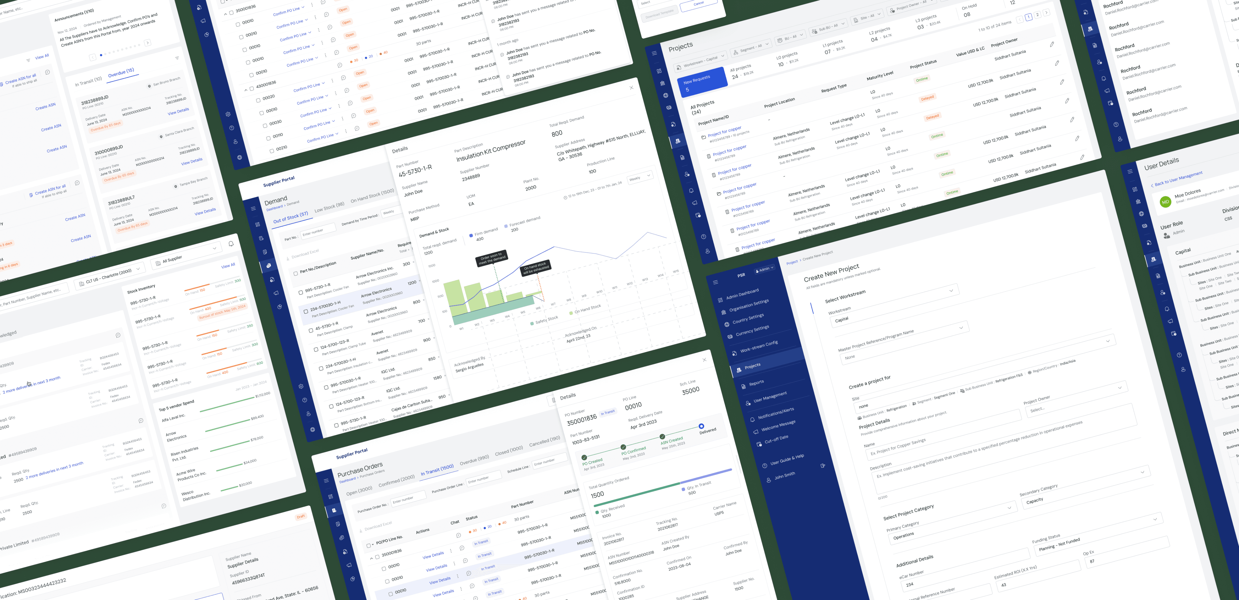
The design system was implemented across two internal enterprise products with different workflows but shared foundations.
Each product retained its own purpose while clearly feeling part of the same ecosystem.
The design system was implemented across two internal enterprise products with different workflows but shared foundations.
Each product retained its own purpose while clearly feeling part of the same ecosystem.
The design system was implemented across two internal enterprise products with different workflows but shared foundations.
Each product retained its own purpose while clearly feeling part of the same ecosystem.
Impact
Impact
The design system was built with scale in mind, and its impact went beyond visual consistency.
The logistics-focused product alone had the potential to reach 300–500k users, with a parallel internal product expected to operate at similar scale. Beyond these two tools, the system was designed to be reusable across the company’s broader suite of global internal products.
By creating a shared foundation early, the system helped support current platforms while setting a baseline for future tools, increasing its reach well into the hundreds of thousands of users over time.
Looking Back
Looking Back
Working within the constraints of an existing UI framework shaped many decisions. While it limited flexibility in some areas, it also kept the system practical and grounded. The time duration was very less as per the product's scope, but it all worked out.
With more time, deeper documentation and automation could have strengthened adoption further.
🔒 Confidentiality Note
Due to confidentiality, product names, metrics, and internal details have been intentionally abstracted. The work shown focuses on structure, decisions, and outcomes without exposing sensitive information.
🔒 Confidentiality Note
Due to confidentiality, product names, metrics, and internal details have been intentionally abstracted. The work shown focuses on structure, decisions, and outcomes without exposing sensitive information.
🔒 Confidentiality Note
Due to confidentiality, product names, metrics, and internal details have been intentionally abstracted. The work shown focuses on structure, decisions, and outcomes without exposing sensitive information.